2021
Vibgroup
UX, UI, Identity
UX/UI Designer
.webp)
Tied a small design team on a complete redesign of Fitosystem's purchase process, an e-commerce that sells natural supplements. We dramatically simplified the user experience focusing on core interactions, speed, and engaging process. Making it beautiful in the process was just king on the cake.
How many times have you felt frustrated while shopping online?
The process is so long, and unclear! It is difficult to move freely through all the purchase steps and in the end, probably, you will not buy anything because all the costs are not correctly highlighted from the beginning. Have you ever experienced any of these feelings? Our users had for sure. Oops, our bad, sorry!
We redesigned the Fitosystem web-shop last year but realized that many people weren't completing the purchase process because they felt overwhelmed by all the steps required. As a result, I aimed to remove the frictions for the user because Fitosystem will soon launch several new lines of products.
As a team, we followed the design thinking methodology, which includes 5 stages: empathize, define, ideate, prototype and test. We eventually created and shipped a high-fidelity prototype to conduct usability tests before launching.
At Vibgroup, we mostly work together. Every stakeholder is part of our design process so we work as a big UX team.
During my research phase, I defined key personas, conducted usability tests, and then designed the layouts to test. The web developer helped coding the fully functional prototype.

We had a tight deadline and a low budget. We thus built our work on the previously collected data, created fictional personas and ended up with a fully functional prototype to test. We were so wrong. What to do from now on, then? Well, the actual design thinking process.
Simply, there wasn't any.

Hanging our heads in shame, we highlighted some pain points and gathered everything we knew from the previous design process to point out where we were wrong.
What products exist to find, compare and buy online supplements?
How do users interact with existing products?
What are users current pain points with existing products?
Which features are essential to users?
A survey was conducted on 20 participants to identify which products and features people are currently using and determine which feature are essential to make feel the user safe.


A series of in-depth interviews were then conducted on 10 participants to further identify pain points, frustrations, needs, and desires with existing products to determine how Fitosystem could improve the overall experience.


All participants used a combination of multiple references to find, save and share online stores
Users value the ability to customize their research to compare products that fit their preferences
Major online stores in the market lack desirable features and feel impersonal, outdated and untrustworthy
A compare feature with tags is paramount when searching for products
Too much information on screen makes users feel overwhelmed, they'd like a more curated experience
Uncurated experience and messy layout during buying process make the store untrustworthy
Heuristic Evaluation was conducted to identify Fitosystem's strengths and weaknesses.

From the data I collected making the next user interviews, I created a user journey map of a fictional user who is going to buy in our shop. It later developed into a low-fidelity prototype.
This allowed us to capture the user’s journey and emotional results with each touchpoint they perform from the very first moment the user landed on the website.
A user journey map was created to identify touchpoints, emotions and weaknesses that emerged from the user interviews.

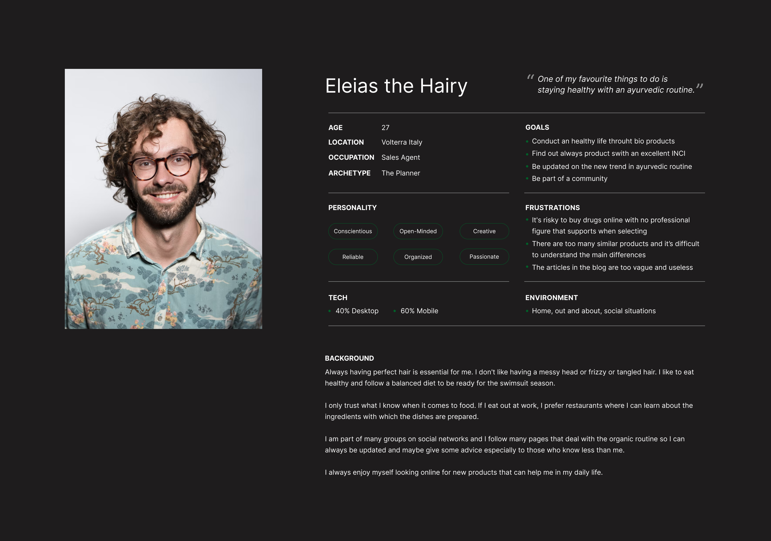
A persona was built based on the data collected to help drive decision making and keep the product focused on solving users pain points, frustrations, and goals.
From here we could decide what actions and features were crucial and beneficial, and identify the actual pain point. Following that, we brainstormed on what makes a purchasing process successful.
We wanted to create a frictionless experience for our users by emphasizing on simplicity and at the same time keeping a balance between freedom versus the guided purchase process, to make the user feel secure throughout the several steps.
To kick-off the design process, quick sketches helped me get ideas on paper to establish which elements were necessary for each screen. A low fidelity prototype was then created for initial user testing.
The primary user flow is the process of searching, buying and sharing with friends.

Rough sketches were done to get my initial thoughts on paper and brainstorm new ideas for specific UI elements.

Using the feedback and insights gained from research and analysis, a hi-fidelity wireframe was created to begin user testing.
A usability study was conducted to determine where improvements could be made and identify new ideas to satisfy user expectations, needs, and desires.
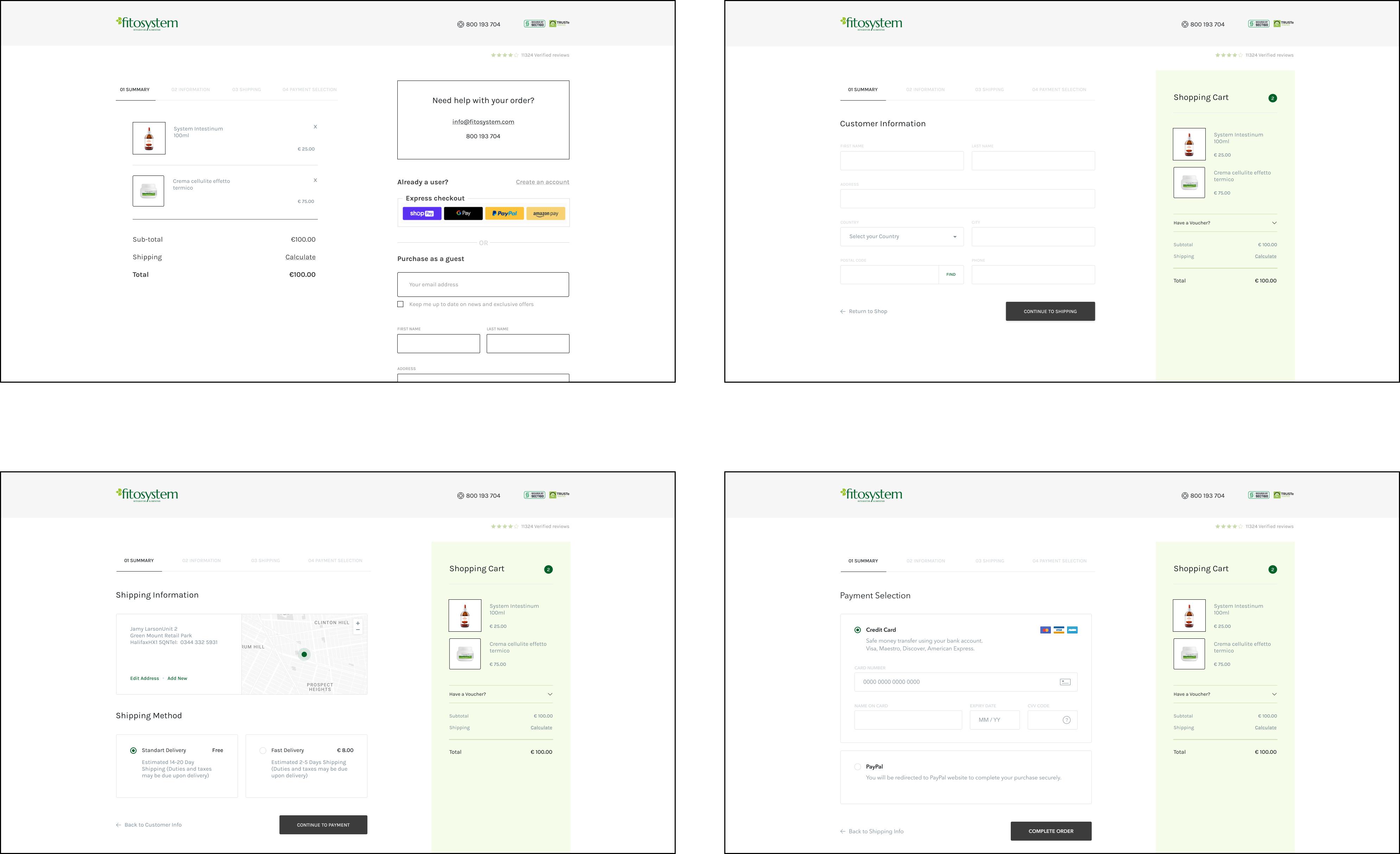
Remove a step from the multi-step checkout process to smooth the overall experience
Use color to differentiate active input fields
Terms and conditions and refund policy not visible during the process
Add a save function to continue from where the user left the checkout process.
Express checkout from list page not available
Share button not visible on list, cart and checkout pages
The outcome of our team shaped up into two new fully-functional prototypes to carry out an A/B test. The test is currently running with 1k contacts.
To our surprise, the version we thought was least reassuring turned out to be the most preferred by the users. We considered what influence it had on the user’s journey to dirty the layout to add further reassuring elements.
An A/B Test was conducted to determine which version leaves the maximum impact and drives business metrics.
We achieved a 35% increase in conversion rates with our newly designed purchase process as compared to the previous version shown in the early results of the tests. Our admin team also noticed that the number of inquiries about how the platform works has decreased substantially, indicating it has become easier to use.
Integrates all needs into one streamlined experience
Suggests more personalized products recommendations
Supports social connection and engagement
Saves favorites for quick reference later
Improved the buying process making it feel more trustworthy
Provides a source of reputable reviews from trusted friends and influencers
This was the first time I made user research with physical people involved in the project. Although I was nervous at the beginning, I soon learnt to manage this situation by putting the interviewee at ease.
Moreover, I noticed that effective communication and short daily stand-up meetings were crucial to our success.
We expect the usability tests on our high-fidelity prototype to validate our hypothesis that the most effective value proposition is one that revolves around the smoothness and engaging purchase process.
I’m looking forward to applying the same approach to other key aspects of the platform.


