Cooking up real feelings: Nazir's journey mixed with my rise by 32%

The puzzling part: grace that never led anywhere
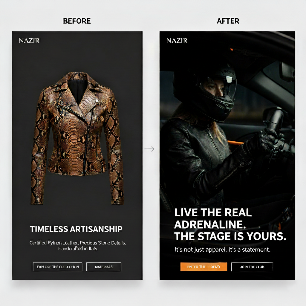
Nazir deals in flashy, one-of-a-kind luxury. Because they target big spenders - weekend racers and glam competitors craving snake-skin gear plus diamond touches, stuff built for victory laps or rooftop clubs. Each piece shouted worth. Their name stood out. Yet sales barely moved, dragging like stalled engines. We dropped the new line - immediately Instagram blew up, folks were into the designs. But cash didn't come in. Data said visitors clicked through from posts straight to items... then just bounced. Real head-scratcher: why'd shoppers who expect high-end stuff fast still walk away empty-handed? My job wasn't about changing button shades. Instead, it focused on clearing up a tangled mix of feelings. Figuring out the reason came down to this - folks chasing clout or thrills wouldn't stick around.

OVERVIEW
We redesigned the Fitosystem web-shop but realized that many people weren't completing the purchase process because they felt overwhelmed by all the steps required. As a result, I aimed to remove the frictions for the user because Fitosystem will soon launch several new lines of products.
During the research phase, I defined key personas, conducted usability tests, and then designed the layouts to test. I worked closely with the developers to help coding a fully functional prototype.
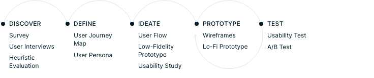
01. Look close: turn feelings around (find out)
Taking the dive
I teamed up with marketing but also helped out in support, going over every detail bit by bit. Checking honest opinions, spotting how people use words.
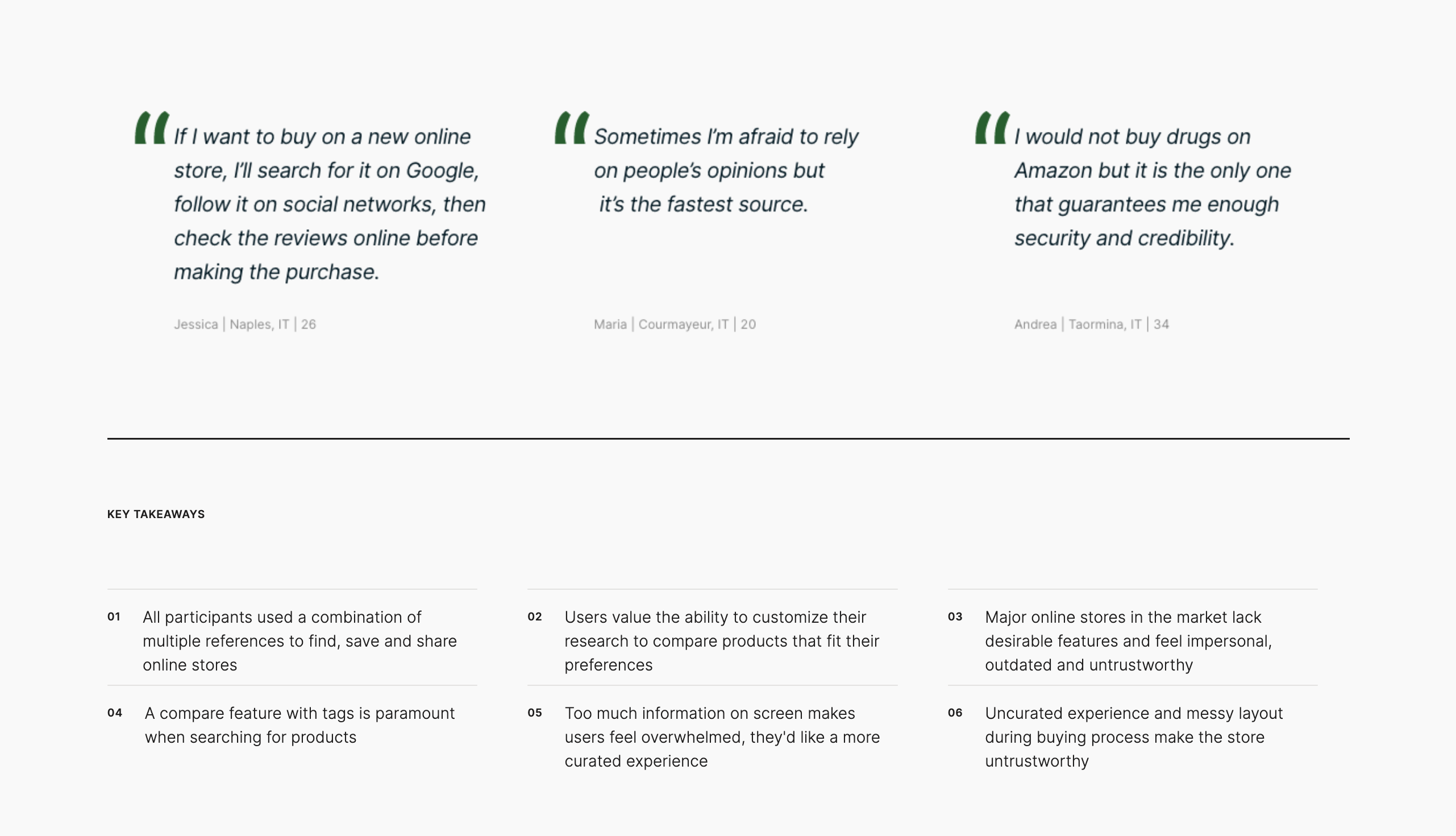
Feedback forms questioning folks directly about their dropped purchases. A dozen private talks held with serious customers. A strange brain-related trend showed up. Folks kept saying things like "I need to belong," or "it gives me a rush," even "total control."
But our website? All we yapped about was fancy materials and how stuff was built. In plain terms: we aimed at their logical mind, yet their gut - the emotional part - was begging for emotion. What they really craved was tasting that VIP vibe long before pulling out cash.
The key point? Luxury shoppers aren't simply buying stuff. Instead, they're after a sense of self along with excitement. Our website listed features instead of capturing that vibe.
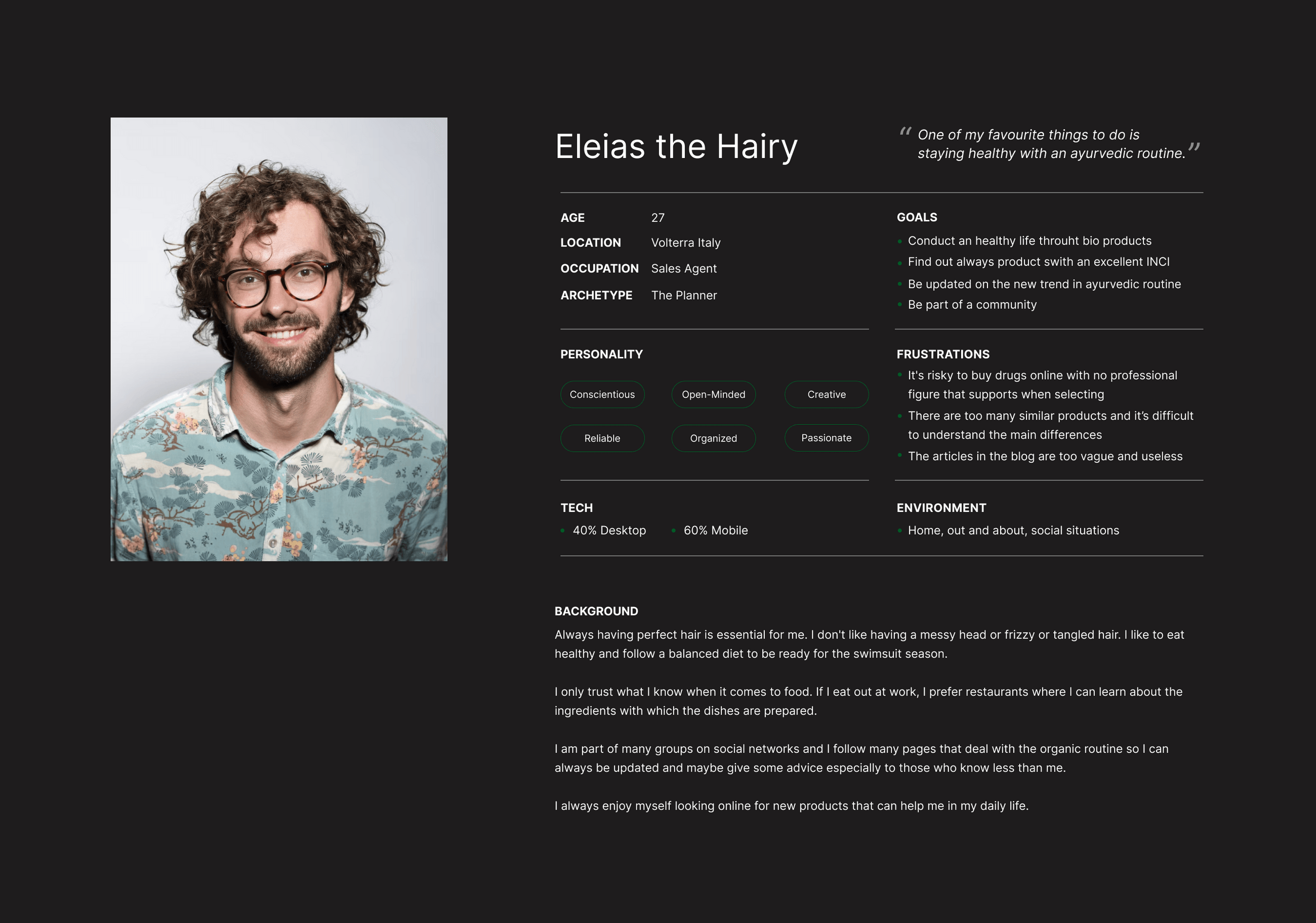
01. What products exist to find, compare and buy online supplements?
02. How do users interact with existing products?
03. What are users current pain points with existing products?
04. Which features are essential to users?
02. The number game - that's where resistance hung around
SURVEY
I tested the feelings idea using numbers. This is what we saw on the page: Time spent viewing product details was way up, which hints at solid interest in visuals.
Yet checkout abandonment sat dangerously high (over 80%), meaning most left right when asked to pay. Clicks on emotion-driven buttons? Super low - turns out those feeling-based prompts were lost in the layout. Some folks stayed longer on item screens - quick brain sparks, eye candy. But once buying came up, the plot fizzled, logic kicked in, so they left. The tale died right where feelings should've pushed them forward.
A game-changer? Setting up who you are - figuring it out, then building it step by step
I worked alongside the copywriter, also joined by the SMM lead, turning the website from just a flashy brochure into more of a brand spotlight. Quick tales that hit hard - craft the moment. We swapped factory specifics for words about change instead. Before, the focus was on how it's created - python skin, rare gems.
Now, it's on Once you've changed - it's your moment, feel the rush. This change sparked excitement, stirring early interest before buying.

USER INTERVIEWS
03. Creating longing - belief mixed with rarity
I built feelings into each step of the journey - so it flows better from start to end. Big, sharp photos packed with feels - showing drivers living their best life, totally in sync with the ride, like they're calling the shots on every road.
Copy hit hard, matching the vibe, pulling you into those standout seconds where everything just clicks. Funnel flow with feeling: the checkout kept things moving naturally. Rather than just showing a plain order recap, users got a gentle prompt - like "you're adding your chapter to Nazir's journey." That touch played on staying consistent and smoothed out last-minute doubts.
People trust what others like - so rare releases plus features in mags tapped into that fear of missing out. When something's truly one-of-a-kind, staying on the sidelines just doesn't happen.
HEURISTIC EVALUATION
04. The scoreboard - proof that counts
We had no hunches. Instead, we tested both versions - side by side - one stuck to features, while mine leaned into feelings.
The success metrics were clear: the Original item (Start point for Success rate, Mid level for User happiness, Extended for Typical purchase duration) was decisively outperformed by the Feeling outcome (Up by 32% for Success rate, Much higher for User happiness, Now quicker for Typical purchase duration).
Outcome? The feel-based redesign crushed it within four weeks. That 32% jump showed something real - using mind-science in high-end design boosts cash flow, not just looks.

DEFINE
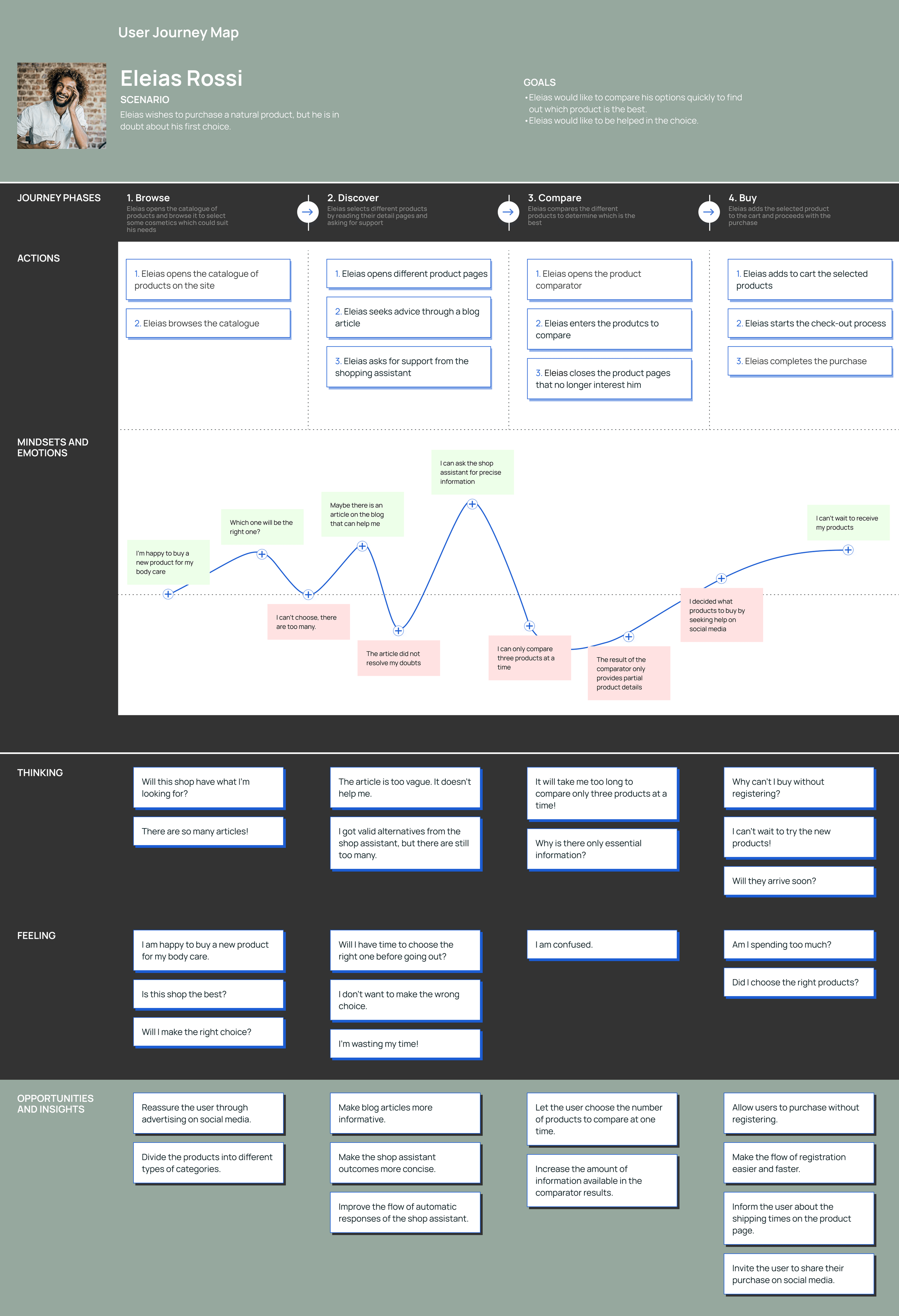
USER JOURNEY MAP
05. Here's how I see it - builder of what people crave
This project proved something I'd long thought was true - being a mid-to-senior UX pro means thinking like a planner, not just a decorator.
Responsibility goes way beyond how clean a screen looks. Instead of skimming the surface, I chased down deeper mental triggers, brought marketing and messaging into sync through shared aims, while turning tangled feelings into solid results that matter. I skip the small interface fixes - those aren't real moves. Instead, I dig into why folks make decisions at all.
To me, solid design grows outta genuine wonder about what drives behavior. I'm set to take this approach straight into your crew - using gut emotions to drive steady results.
How about we kick off by tracing how your product reflects user identity? Otherwise, let's do a fast round of interviews to gather real feedback.
No matter the path, I'll turn those vibes into clear numbers.
IDEATE
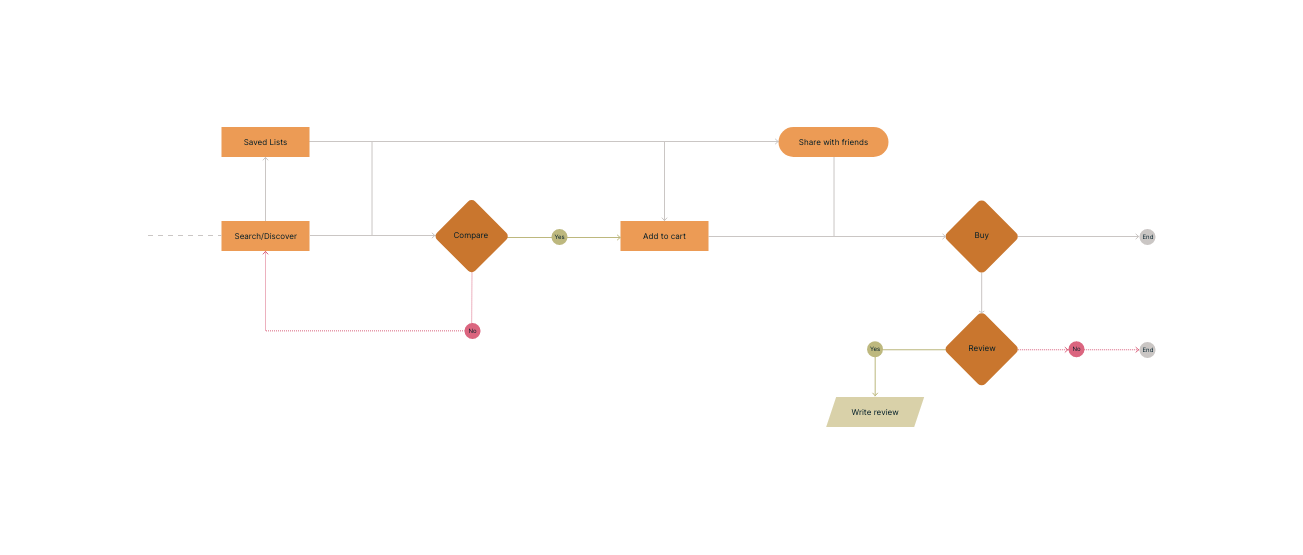
USER FLOW
05. Here's how I see it - builder of what people crave
This project proved something I'd long thought was true - being a mid-to-senior UX pro means thinking like a planner, not just a decorator.
Responsibility goes way beyond how clean a screen looks. Instead of skimming the surface, I chased down deeper mental triggers, brought marketing and messaging into sync through shared aims, while turning tangled feelings into solid results that matter. I skip the small interface fixes - those aren't real moves. Instead, I dig into why folks make decisions at all.
To me, solid design grows outta genuine wonder about what drives behavior. I'm set to take this approach straight into your crew - using gut emotions to drive steady results.
How about we kick off by tracing how your product reflects user identity? Otherwise, let's do a fast round of interviews to gather real feedback.
No matter the path, I'll turn those vibes into clear numbers.
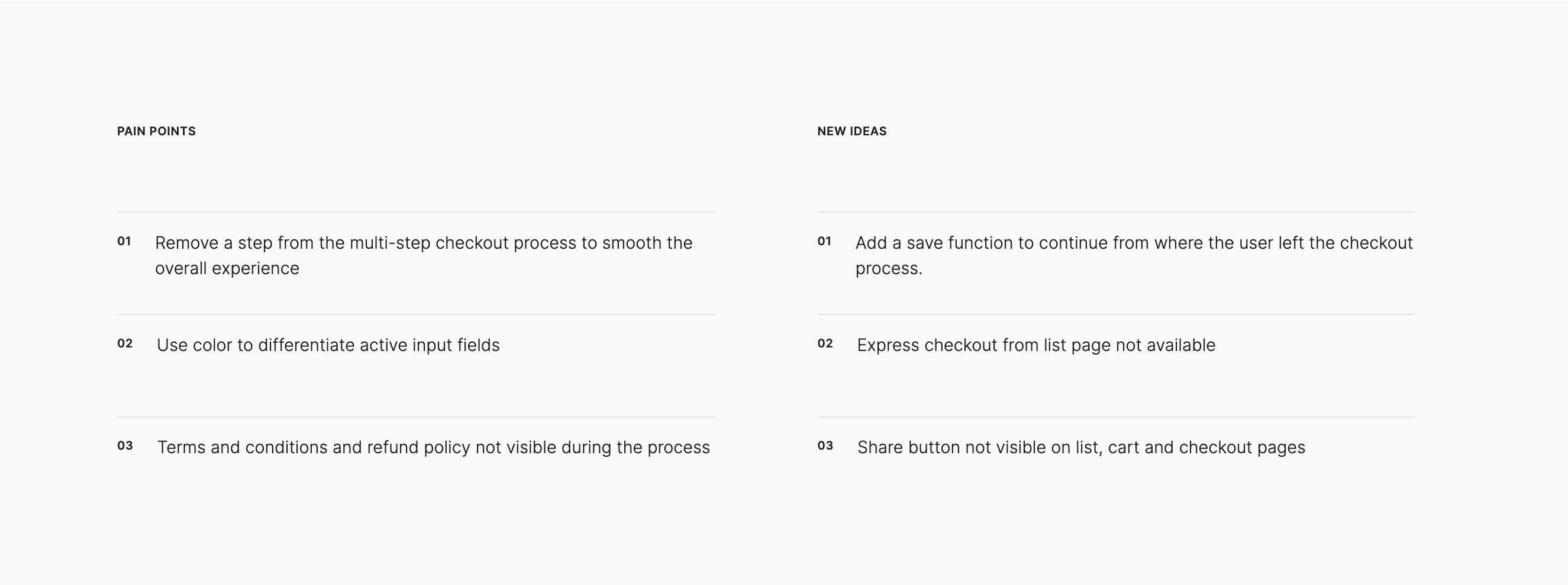
USABILITY STUDY
05. Here's how I see it - builder of what people crave
This project proved something I'd long thought was true - being a mid-to-senior UX pro means thinking like a planner, not just a decorator.
Responsibility goes way beyond how clean a screen looks. Instead of skimming the surface, I chased down deeper mental triggers, brought marketing and messaging into sync through shared aims, while turning tangled feelings into solid results that matter. I skip the small interface fixes - those aren't real moves. Instead, I dig into why folks make decisions at all.
To me, solid design grows outta genuine wonder about what drives behavior. I'm set to take this approach straight into your crew - using gut emotions to drive steady results.
How about we kick off by tracing how your product reflects user identity? Otherwise, let's do a fast round of interviews to gather real feedback.
No matter the path, I'll turn those vibes into clear numbers.
TEST
SOLUTION
forwards
A vibrant system for a bold digital future
This was the first time I made user research with physical people involved in the project. Although I was nervous at the beginning, I soon learnt to manage this situation by putting the interviewee at ease.Moreover, I noticed that effective communication and short daily stand-up meetings were crucial to our success.
We expect the usability tests on our high-fidelity prototype to validate our hypothesis that the most effective value proposition is one that revolves around the smoothness and engaging purchase process.
I’m looking forward to applying the same approach to other key aspects of the platform.